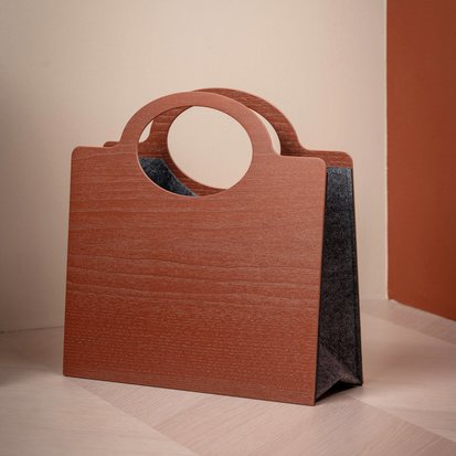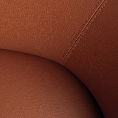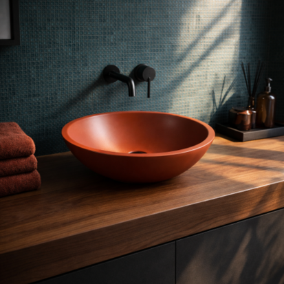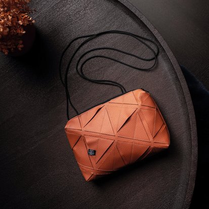
Colorstory No.10
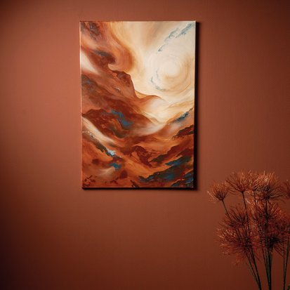
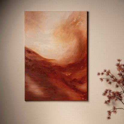
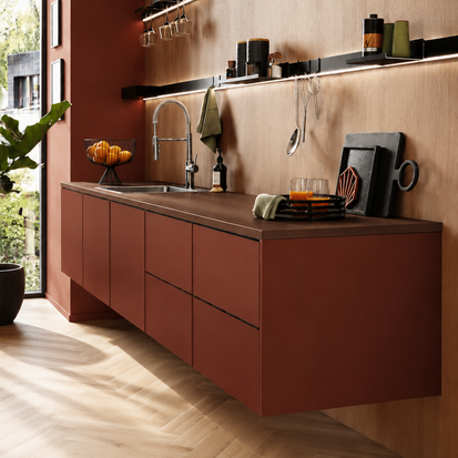
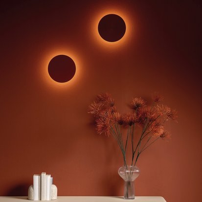
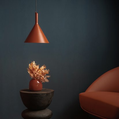
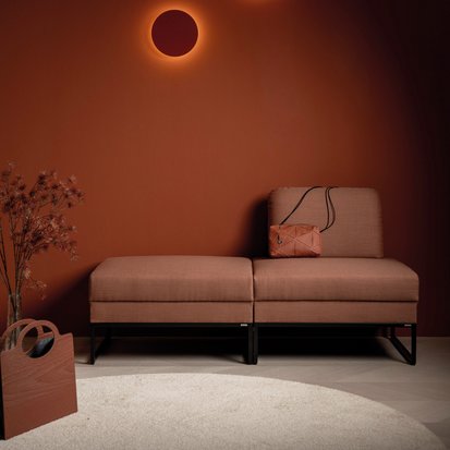
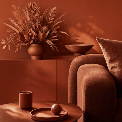
“mother earth!” represents a new generation of colors: grounded, calm, unifying. This terracotta shade does more than just appeal to the eye – it taps into a deeper longing for stability, a sense of belonging and inner peace. In a world that is spinning ever faster, “mother earth!” becomes an emotional response to uncertainty and mental overstimulation.
Psychologically, the color has a regulating effect. It does not draw attention to itself, but rather calms and unifies its surroundings. Its subdued warmth reduces visual restlessness and creates space for concentration, empathy and emotional grounding. At the same time, it has substance – it radiates strength without being overbearing. This combination makes it particularly valuable for spaces where a sense of security and self-grounding is to be fostered.
‘mother earth!’ evokes archaic associations – with clay, mud walls, and walls warmed by fire. It subtly conveys the message: something has grown here, something enduring, connected to the passage of time. Spaces designed with this color feel profound and authentic – never superficial or arbitrary. This strengthens people’s emotional connection to the place.
Interior design with “mother earth!” is not a statement of volume, but one of attitude: those who work with this color create spaces that provide support. Spaces that do not impose themselves, but offer stability. It acts as a calm, wise force in the background – exactly what many people today intuitively seek.


Duftstory No.10
The shade ‘mother earth!’ – a warm, muted brick red – acts as an archaic echo of our longing for security, a sense of belonging and inner strength. It symbolises emotional stability, resilience and a sense of home. Yet its effect goes beyond visual perception: when combined with a suitable room fragrance, ‘mother earth!’ unleashes its full psychoactive power.
Whether in the bedroom, the kitchen or a restaurant – the fragrance should always support the emotional function of the room. Whilst sensually warm accords such as earthy roots, spicy woods or subtle, slightly smoky spice notes create a sense of deep relaxation and security in the bedroom, fruity-spicy nuances such as coriander seeds, pink pepper or fresh red apple enliven kitchen and dining areas. In living rooms or reception areas, exotic floral tones with a hint of wood or gentle rose notes promote emotional openness and social connection.
Spaces designed to engage multiple senses are gaining importance worldwide: colors and scents have a direct effect on the limbic system and, on a subconscious level, promote well-being, trust and emotional balance. For interior designers, this opens up creative potential that goes far beyond style and aesthetics – towards emotional architecture.
“mother earth!” is not just a color. It is a multisensory statement in favour of nature.