from design intelligence to real spaces
Since 1997 TRENDFILTERⓇ has been translating societal change into relevant interior design. At COLORNETWORKⓇ, we bring this expertise together with leading designers, architects and more than 40 manufacturers.
Together, we create enduring color and material worlds for real spaces — from color, wood, textiles, surfaces and lighting to scent and art. Human-curated, cross-industry and physically tangible.
beyond color: scent and spatial experience
We experience spaces with all our senses. That is why we explore our Sustained Colors not only visually, but also through scent. Together with experts, we examine which olfactory worlds can support and enhance the psychological impact of a color.
The result is inspiration for multisensory interiors in which color, material and scent come together to create a holistic spatial experience.
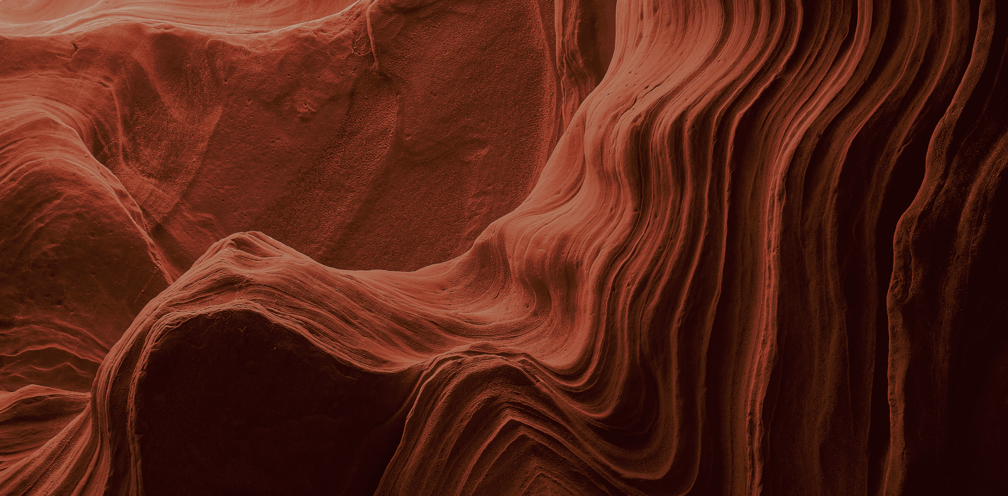
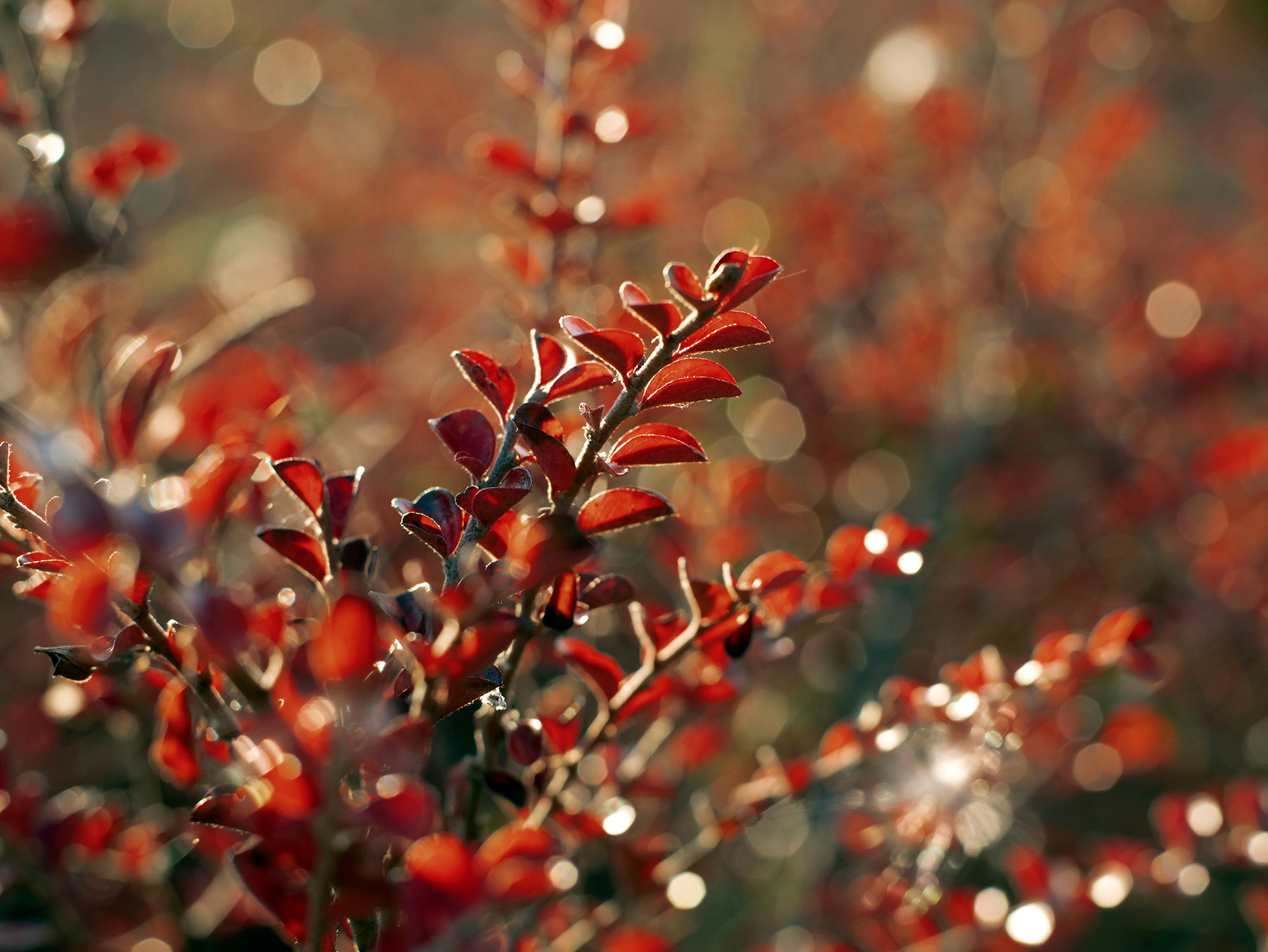
‘mother earth!’ is our ‘Sustained Color No. 10’ by Constanze Schütz and Roman Proubasta from Barcelona. This terracotta shade does more than just appeal to the eye – it taps into a deeper longing for stability, a sense of belonging and inner peace. In a world that is spinning ever faster, “mother earth!” becomes an emotional response to uncertainty and mental overstimulation.
The fragrance story behind “mother earth!” is a multisensory statement in favour of nature. Whilst sensually warm accords such as earthy roots, spicy woods or delicate, slightly smoky spice notes create a sense of deep relaxation and security in the bedroom, fruity-spicy nuances such as coriander seeds, pink pepper or fresh red apple enliven kitchen and dining areas. In living rooms or reception areas, exotic floral tones with a hint of wood or gentle rose notes promote emotional openness and social connection.
color in connection. materials in harmony.
COLORNETWORK brings products and materials together to create holistic interior worlds. It is not only about tone-on-tone color matching, but about the precise interplay of color, wood, metal, textiles, surfaces and gloss levels.
We curate combinations that complement one another and create a harmonious whole within a space. The result is reliable design guidance for architects, interior designers and discerning specifiers – cross-industry, material-conscious and created for real interiors.
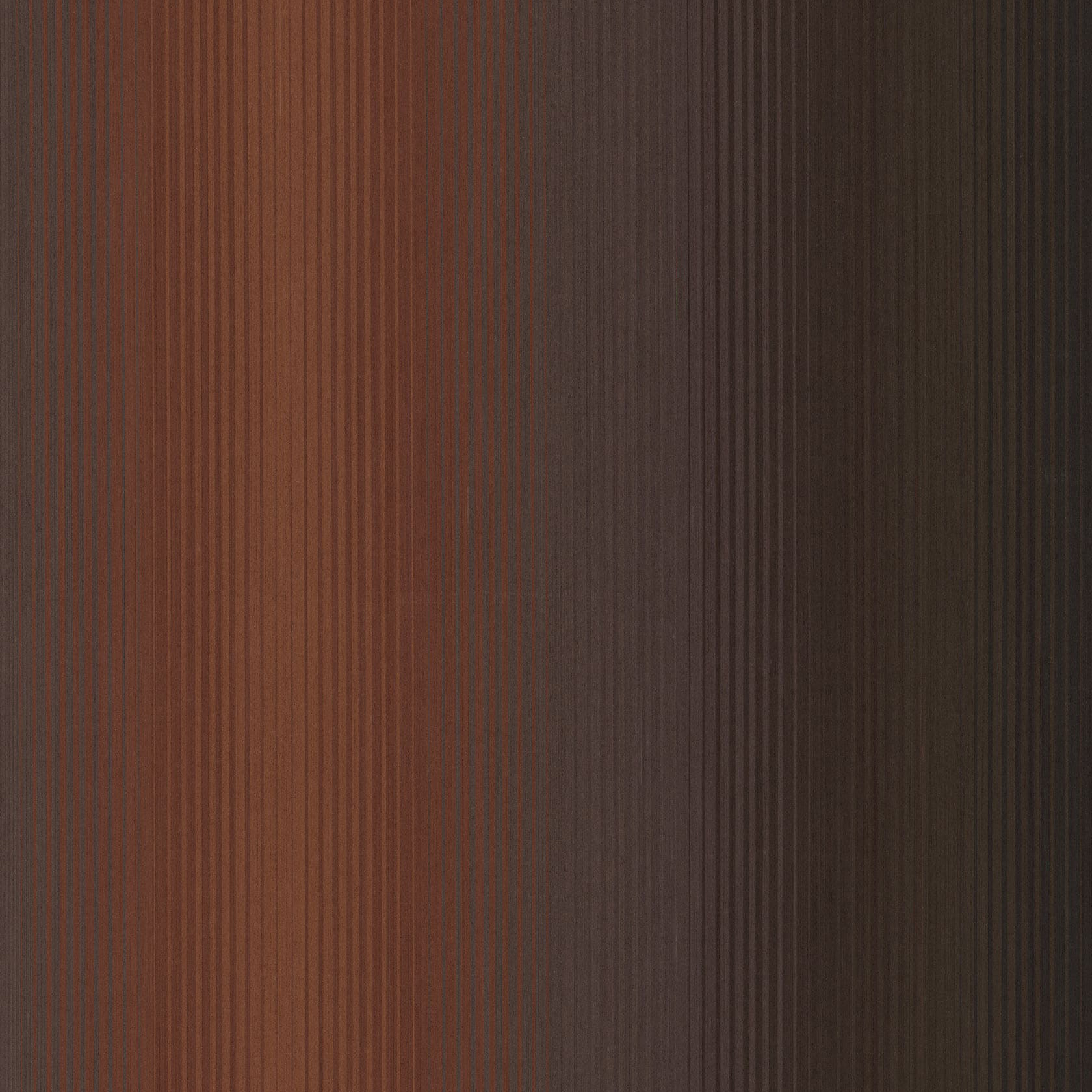
For the “mother earth!” range, for example, ALPI offers this particularly expressive, multi-colored real wood veneer through our partner HWB. It features a color gradient ranging from “mother earth!” to burgundy, brown, grey and black. A star in any interior. Product: ALPI Tramonto, Design: Konstantin Gricic
art in the color scheme
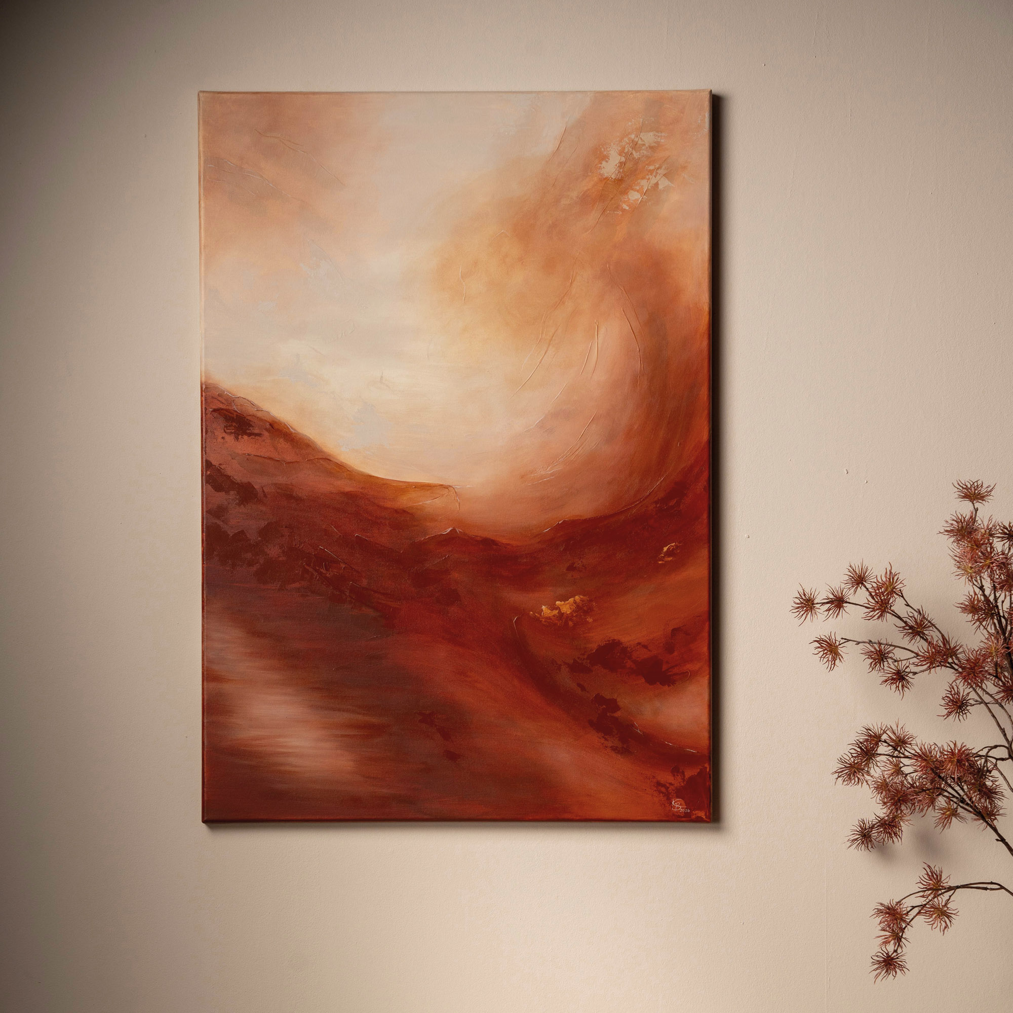
As digitalisation advances, people, creativity and inspiring art are becoming increasingly important. We also view color as an art form, which, as part of our color and materials concept, enhances the spatial experience. To this end, we collaborate with the young artist Kristin Borchard, who creates abstract acrylic artworks to complement our Sustained Colors range – including bespoke pieces commissioned by clients. In this way, we offer discerning interior designers and architects a further dimension of holistic interior design that delights users and clients alike.
sustainable wall paint
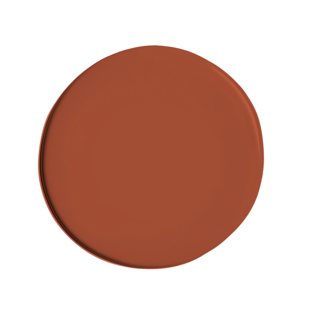
our wall paint partner offers an eco-friendly, high-quality and healthy product that is odourless, provides excellent coverage and is easy to apply! This wall paint is sure to complement your new interior design!

sustainability

Sustainability and green building is gaining in importance worldwide. Planners, setters and designers are looking for holistic environmental solutions. But WHAT is sustainable?
the designexperts
Every year another panel of experts of eminent designers and interior designers is looking for a special colour, which through zeitgeist, durability and compatibility with other colours, has earned the right to become one of our ‘Sustained Colors’.